iFalcon
Created the user experience and interface for iFalcon, a vehicle and machinery tracking and monitoring application for CCC. With one code-base, we were able to build the adaptive design so that the UI would fit freely on a desktop while still being scalable and touch friendly on tablets. iFalcon has since been deployed in remote construction areas and uses the polled data to inform decisions related to: productivity, energy conservation, and route optimization.

GOAL
Design and build an adaptive interface for iFalcon, a vehicle and machinery tracking and monitoring web and tablet application. The interface and experience should cater for users on project-site from the Plant Machinery and Vehicles (PMV) department, as well as upper management in the comfort of their offices.
PROCESS
Adaptive UI Design, Interaction Design
The biggest challenge in this project was the need to display huge amounts of data in an app that is supposed to look and function the same both on the web and the tablet. So, from early stages, I knew I had to look closely at all the data-intense objects that were to be displayed, try to make sense of their logic, and figure out how they would streamline into a typical employee’s functional process.
After examining some of the existing solutions that employees were using, I noticed that one of their biggest usability losses was the way the space allocated by maps was being used. In such a data-dense application, maps were one of the users’ main focal points, and so the overall layout of iFalcon had to be maximized to cater for that.
To do so, sliding panels were built for main features such as Search and Search Results. I used tabs within the right panel to help users focus only on the active content whilst still maximizing map screen real estate.

Sliding Search Panel allows for maximizing the map’s screen real estate, while the panel’s tabbed view helps properly retain user focus and keep information organized with minimal space.

Flight Progress Strips like these inspired my design for interactive asset rows
Within the tabs, inspired by the physical “Flight Progress Strips” used in Air Traffic Control centers, equipment rows are initially shown as collapsed snippets and stacked one over the other to increase the amount of assets that can be shown without scrolling. Collapsed rows show state info, titles, descriptions and basic operations.
Similar to moving flight strips from one state column to another, once an asset row is dragged to the map, it automatically gets stacked under the “Tracked” tab and the focus is switched to it. Once users want to drill into one asset, they can click to expand its corresponding row, and an extensive set of related properties is revealed in addition to a set of advanced controls.

Similar to moving flight strips from one state column to another, once an asset row is dragged to the map, it automatically gets stacked under the “Tracked” tab and the focus is switched to it.
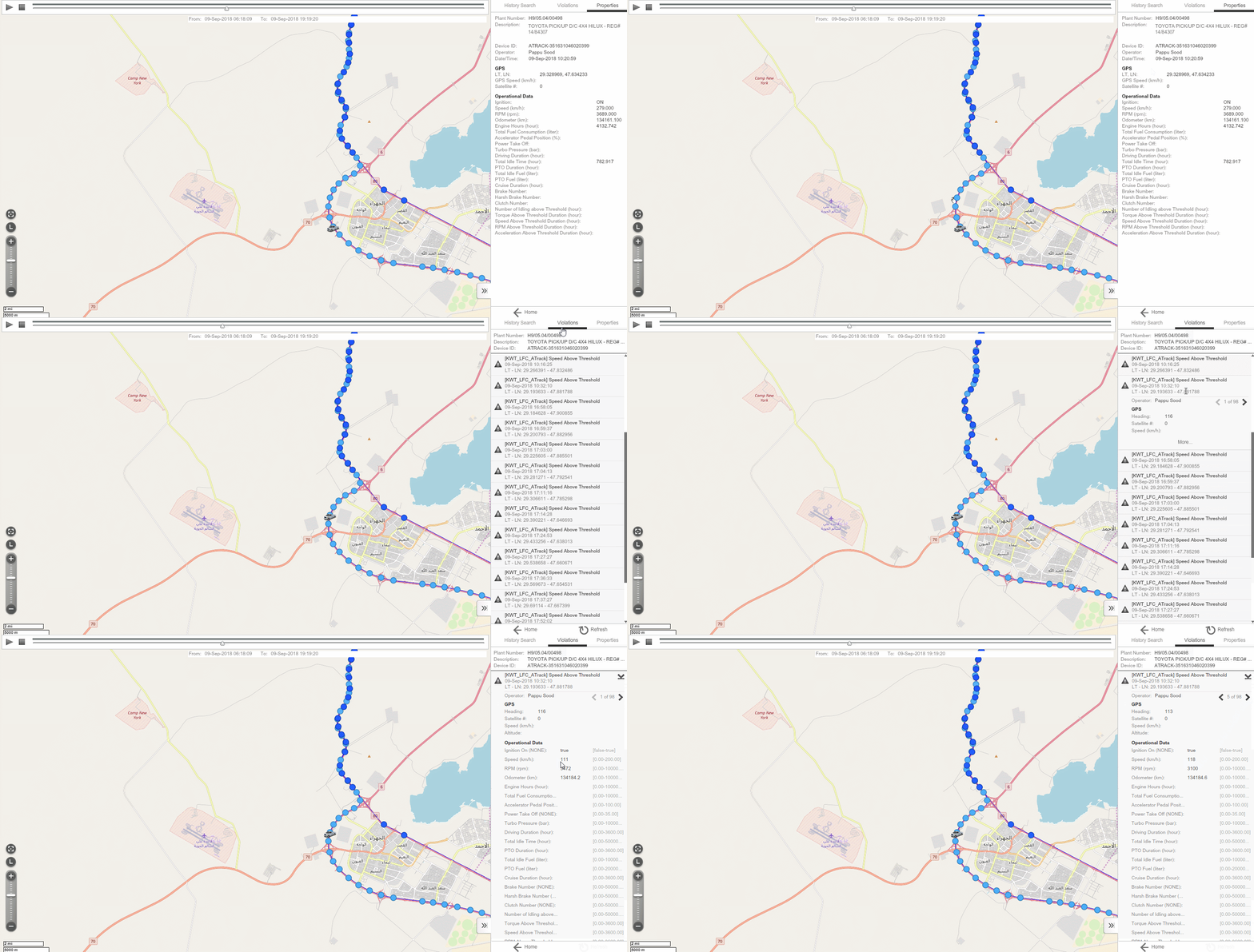
iFalcon also monitors the history of its equipment, and within its History View, trips made during a selected time frame can have their paths illustrated on the map. A user can then select any path point on the map to reveal its Properties and associated Violations. Since every violation could contain a snapshot of all the recorded properties at a specific time, that made it almost impossible to show all this information at once without disorienting and overwhelming the users. So, with many design iterations, I overcame this challenge by devising an interactive drill-down approach to reveal this information progressively.

An interactive drill-down approach progressively reveals the Violation properties without disorienting and overwhelming the users.
Finally, I carefully hand-crafted every icon and symbol in the interface to reflect its underlying meaning and various interactive states. All graphical objects were also designed to scale, based on whether a user was using iFalcon on the web or on a tablet.
RESULTS
iFalcon gave its users at CCC an adaptive, on the go, and convenient way to track their vehicles and other tagged assets, cutting down hugely on the need to rely on decentralized information that came from various other software or personnel. This, in turn, led to various project budget cuts and many other savings caused by better fleet organization.
TOOLS UTILIZED
Markers and paper, Adobe Photoshop, Adobe Illustrator, Adobe Flex, Adobe Air
“iFalcon” is a CCT International product. All Rights Reserved.

